Blogs about code
8.2.2017
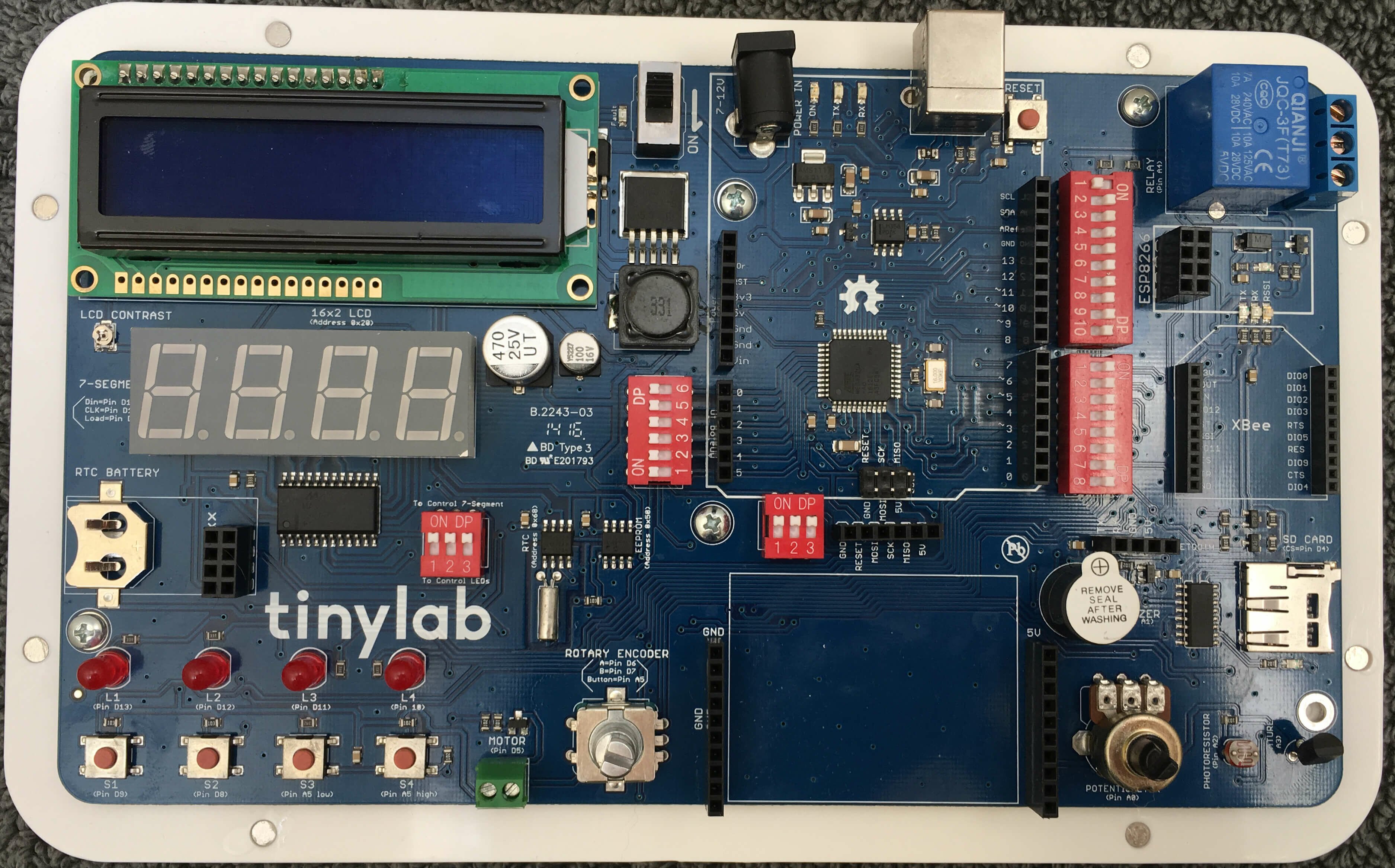 I've been fiddling around with my - an all-in-one prototyping board with an embedded Leonardo and a fair selection of components. I'd already got it working with Node and Johnny-Five. Next I wanted to do something which demonstrated interaction between the software and some real-world conditions.
Note that my tinylab (perhaps because it's an early crowd-funded version) doesn't have the breadboard shown in the current production versions of the tinylab. No worries - a mini breadboard (without the connector tabs) fits in there perfectly.
I made a "flashlight" - where an LED gets brighter when the hardware detects less ambient light. Since all the components on the tinylab are already built in, I didn't have to do any wiring. It's pretty easy to test by covering the photoresistor with your finger. Here is the code:
var five = require("johnny-five"), board, photoresistor;
var board = new five.Board();

board.on("ready", function(){

  var led1 = new five.Led(10);

  photoresistor = new five.Sensor({
    pin: "A2",
    freq: 500 // Data is polled every half second
  });

  maxLight = 750 // Set this to the "high" value of light in your room.
  minLight = 250 // Set this to the "low" value of light in your room.
  lightRange = (maxLight - minLight) // Will change for different rooms.

  photoresistor.on("data", function() {

    currentLight = this.value;
    ledValue = (((currentLight - minLight) * 255) / lightRange);
    ledValue = Math.max(ledValue, 0);
    ledValue = Math.min(ledValue, 255);

    console.log("Photosensor: " + this.value + "     ledValue: " + ledValue);
    led1.fade(ledValue, 500); // Smooth transition of LED brightness

  });

});
You'll need to set the maxLight and minLight values for your environment.
With this experiment, you now have a way to read a value from your environment, report it to a computer, and act on it.
4.7.2017
The STEMTera Breadboard is a nifty combination Ardunio (Uno R3) / breadboard. It has a Lego-compatible backside and it's available in black, white, and pink. When I got mine, of course the first thing I did was get it set up to run with Johnny Five. 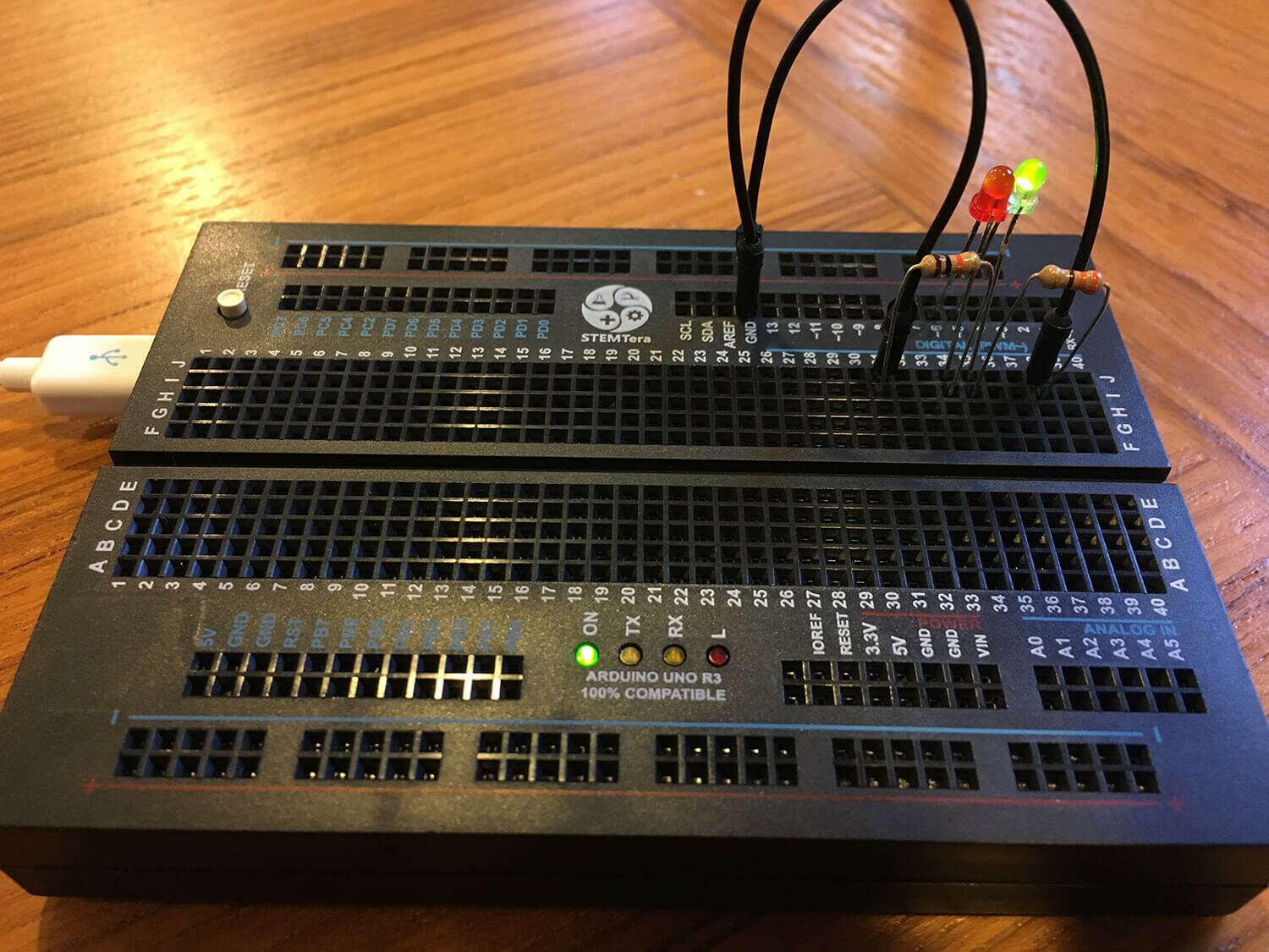
Basic Functionality / Hello world
Making an LED blink is the Hello world! of hardware. It's common to just use an Arduino's onboard LED on pin 13. Here's what you do to get up and running from scratch:
- Make sure Node, npm, Johnny-Five, and the Arduino app are all installed and updated.
- Connect the StemTera breadboard to your computer.
Protip: Be sure to use a USB mini cable that supports both charging and data transfer. I've been fooled more than once by a charging-only cable. When I tried using a charging-only cable to flash the Arduino, I'd see the "On" LED turn on, but the Arduino app didn't report the device on any port. I've since purged my supplies of any charging-only cables, hopefully.
- In the Arduino application, from the Tools menu, select Port and set it to whatever is newest (something like /dev/cu.usbmodem1441); the Arduino app should detect the port that your breadboard is connected to. Then from the Tools menu, set the Board to Arduino/Genuino Uno. Then from the File menu, choose Examples, then Firmata, and finally Standard Firmata. Then from the File menu, choose Upload. When the upload is successful, you can close the Arduino app.
- Open up your terminal / command line and create a new file called
blink.js. Navigate to this file's location. Put this code in the file and then save it:
var five = require("johnny-five");
var board = new five.Board();

board.on("ready", function() {
  led = new five.Led(13);
  led.strobe( 1000 );

  this.repl.inject({ // make led available as "led" in REPL
    led: led
  });

});
- From the command line, type
node blink.js and then hit enter or return.
- Your onboard LED should start blinking on and off every second - yay!
- In the new prompt from Node (called the REPL), you can interact with the board's LED. Try any one of these:
-
led.stop();: The LED will stop what it's doing, and stay at it's current state.
-
led.strobe(3000);: The LED will blink on and off every 3 seconds. You can change the 3000 to the number of milliseconds you want the LED to blink at.
led.off();led.on();
Red and Green LEDs
 Now let's add external LEDs (and protective resistors of course). Build your circuit as shown here, using 2 330? resistors, two 3mm LEDs, and two jumper wires. This is the magic of the StemTERA breadboard - the circuit doesn't need to hop back and forth between the breadboard and the external Arduino.
Here's the code - store it in a file and run it as with the first block of code.
var five = require("johnny-five");
var board = new five.Board();

board.on("ready", function() {

  // We can address them separately, or together in leds
  var red = new five.Led(6);
  var green = new five.Led(5);
  var leds = new five.Leds([red, green]);

  green.off();
  red.on();
  leds.blink(1000);

  this.repl.inject({
    leds: leds
    // leds.stop() // Stop the strobing
    // leds.off // Turn them both off
    // leds.stop().off(); // Combine!
  });

});
You should see the red and green LEDs alternating between on and off every second, and only one of the LEDs will be on at a time.
The interesting thing about this code is that it uses the Leds class - which allows us to control all the LEDs at the same time. At first, the green LED is off, and the red one is on. Then we blink the leds class; flipping the on/off state of each LED at the same time. You could use this to easily control many more LEDs.
8.17.2016
I got my tinylab last week; it's a nifty little prototyping board with an Arduino Leonardo and a bunch of embedded components that was funded on IndieGoGo. So naturally I wanted to get Johnny-Five working and start fiddling with the tinylab as soon as possible. Unfortunately, it seems like the hardest part of every hardware project is the grand upgrading of the softwares that must proceed fiddling. Here's the process that worked for me.
-
Re-install Node. My Node installation was a few versions old, and somehow npm was missing. So I went ahead and installed Node.js from https://nodejs.org/en/download/. I decided to live dangerously and install the "Current" version rather than the Stable one.
-
Upgrade Arduino.app. My Arduino install was older than the Leonardo, so I needed to upgrade it too. I got version 1.6.10 from https://www.arduino.cc/en/Main/Software.
-
Upgrade npm packages.
npm outdated showed that several packages (including Johnny Five) were out of date. This required a few rounds of npm update.
-
Write the Johnny Five code. I checked the excellent Johnny Five docs and wrote this code for the first LED on the tinylab.
var five = require("johnny-five");
var board = new five.Board();

board.on("ready", function(){
  var led = new five.Led(13);
  led.pulse(1000);
});
This should make LED1 (on pin D13) pulse on an off. At first I tried using "D13" to address the LED (since that's what's silk-screened on the board) but it was just 13 that worked.
Success!
Here is some tinylab documentation that might come in handy next time:
1.10.2016
Flexbox is a great CSS module for making clean and flexible layouts. But flexbox is a bit odd, it can be tricky to get the results you're looking for when you're just getting started. Here are some things you should know about flexbox:
-
display: flex; goes on a parent element. Then all children of that element become flex items and will accept other flex properties.
- Don't use
float or box-sizing: border-box; with flex elements. It won't work they way that you'd expect from display or inline elements.
-
flex-direction defaults to row to lay flex elements out horizontally. Sometimes, you want column to lay elements out vertically instead.
-
margin-[side]: auto; makes the margin use up all the available space on that side. If multiple margins (in the same dimension) are auto, they each take an even share of the available space
-
flex-grow: defaults to 0; where elements won't grow beyond the content's width. You probably want flex-grow: 1. Among other things, this handy for making all input elements stretch to use up the remaining space:
-
flex-wrap: defaults to nowrap, where all elements will be stuffed on a single line (or a single column, for flex-direction: column;). Alternately, you may want flex-wrap: wrap; to allow the elements to flow to multiple rows.
- Flexbox is well-supported in all recent versions of Firefox, Chrome, Safari, Chrome, Edge, mobile browsers, and even passably-well supported in IE. See http://caniuse.com/#feat=flexbox.
For more about flexbox, see:
Breakpoint Backgrounds Bookmarklet.
7.29.2015
When working with media queries, I find it useful to set a page's background color to something to indicate the breakpoint change. But it gets tedious to set it in the browser development tools over and over again, so I figured I'd just handle it with a bookmarklet - a block of JavaScript that you can execute by using a bookmark in your browser.
Since this is just a debugging tool on a local machine, even the simplest methods will get the job done. The most interesting thing is the enclosing javascript:(function(){ and })(); - just javascript protocol which tells the browser to execute it, and wee little anonymous function to hold everything together. Inside that, I create a style tag, and populate it with new media queries and declarations: set the background color to magenta for roughly mobile width browsers, teal for tablets, and orange for widescreen. (I couldn't think of an alliterative color for "w", since I usually wanted to overrule a white background.) All of the styles have a !important to avoid worrying about specificity. Here's the whole thing:
javascript:(function(){
  var css = document.createElement("style");
  css.type = "text/css";
  css.innerHTML = "@media only screen and (max-width: 800px) { body { background-color: teal !important; } }" +
    "@media only screen and (max-width: 540px) { body { background-color: magenta !important; } } " +
    "@media screen and (min-width:1300px) { body { background-color: orange !important; } }";
  document.body.appendChild(css);
})();
Just load this up inside the location field for a new bookmark, and run it whenever you want to add the colors. Feel free to change the breakpoints to something for your site. It's just CSS on the inside, so you might have to reset a few more colors or adjust the selectors for your site.
For more on bookmarklets, see from Cascadia JS 2014.
More blogs about code:
-
Colorblindness Simulation with JavaScript. — 3.7.2015
-
Vertical Centering is Solved. — 1.26.2015
-
CSS Hacks. — 6.21.2014
-
CSS Magic - border-box. — 5.26.2014
-
Notes - Intro to Node. — 5.14.2014
-
CSS for Variable Height Elements in a Grid. — 12.16.2013
-
Sassconf 2013 Notes. — 10.29.2013
-
CSS Magic: Containing floats (clear-fixing) with overflow: auto;. — 10.7.2013
-
CSS3 Generators. — 7.9.2013
-
Quick and Dirty Mobile Friendly Updates. — 4.24.2013
-
PHP Current Year. — 3.5.2013
-
HTML5 Default Types. — 1.16.2013
-
Quick and Dirty Vertical Centering for Headers. — 11.9.2012
-
A jQuery Demo - Show, Hide and Toggle. — 10.3.2012
-
Title Vs. Alt. — 8.3.2011
-
getElementsByClass. — 6.6.2011
-
On URIs. — 5.18.2011
-
Selecting Children in the DOM. — 5.8.2011
-
Quick And Easy CSS Targeting. — 1.11.2011
-
Dynamically Adding a JavaScript Element. — 7.21.2010
-
IE8's Compatibility Mode. — 3.20.2010
-
Appending an External JavaScript File. — 12.27.2009
-
Noscript. — 8.18.2009
-
Smooth Animation Using jQuery's slideToggle(). — 2.18.2009
-
jQuery - Vertical Show / Hide. — 9.9.2008
-
Custom Dreamweaver Snippets Folder — 6.12.2008
-
Webmonkey is Back. — 5.21.2008
-
Simple This. — 4.11.2008
-
Fancy HRs with CSS. — 10.25.2007
-
Classy Links. — 9.14.2007
-
Clearfix (with an IE7 solution). — 8.21.2007
-
A CSS Styled Form. — 7.18.2007
-
Equal Height Columns. — 5.27.2007
-
IE and .PNGS - Fini. — 5.7.2007
-
Goomba Code. — 1.9.2007
-
Blah Blah Blah CSS. — 8.29.2006